top of page


2049 Book
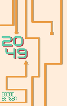
I designed the book cover for the sci-fi novel 2049. I collaborated with the author to capture the dystopian and futuristic feel they wanted to portray.
Cover

01.
At the beginning of the design process, the author and I collaborated on initial symbolism that would best portray the sci-fi feel of the novel. Then I generated many different concept directions that were inspired by technology, the 1940's doomsday clock, and other sci-fi symbols that they wanted to see such as analog and digital circuitry.


02.
The author and I then decided on a concept for the foundation of the design to be based on. We chose the enlarged cover title with the 1's and 0's in the background as our canvas.

03.
With the initial concept, I asked the author what kind of emotions he wanted to capture when readers first looked at the cover of the book? The author and I discussed and decided upon a futuristic dystopian feeling and slightly ominous touch. I then started experimenting with the different ways we could achieve this. To the left is the experimental journey of the cover at this stage.


6


7


5


1


2


4

3

04.
After many iterations, my client chose the design they thought best represented the book. We both thought that the end result gave the title more dimension. The full cover spread can be viewed below. :)

bottom of page